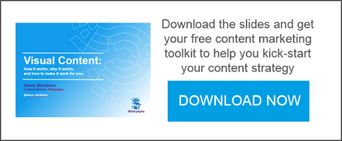
Danny Blackburn presented his views, tips and tricks on visual content marketing to the Content Marketing Association earlier this month.
We’ll start with a spot quiz; who knows what this is? I’ll give you a clue, it’s a newspaper. A newspaper from 1854 in fact. You wouldn’t know from looking at it, but this is one of the most powerful pieces of content ever made.

It’s this, The Charge of the Light Brigade. A piece of content that depicts one of the most dramatic moments in British military history.

Now both the painting and the newspaper article are about the same event, but it’s the painting – the visual version – that has the most immediate impact. You might not get the same level of detail, but the painting communicates an awful lot of information very quickly and very powerfully.
Human beings, both through biology and millions of years of evolution, are hard-wired to absorb content visually. Around 50% of the brain is devoted to processing visual signals and 70% of all your sensory receptors are in your eyes. We also had visual content long before we’ve had language, especially written language, so it’s no surprise that we are predisposed to visual content.
Humans are hard wired for visual content
Visual content works effectively and concurrently on two levels. Firstly, it works on a cognitive level, my increasing comprehension, recollection and retention of information. Secondly, it works on an emotional level, in so far as it has the ability to affect and enhance our emotions and attitudes.
And on top of all of this, it works incredibly quickly. Human beings can process an image in as little as 13 milliseconds.
This Foursquare graphic from 2011 is a great example of this. It shows how Americans travelled across the Thanksgiving and Christmas holiday periods.

This image has the cognitive qualities of good visual content, in that we can visualise the data, and it has the emotional element of travelling home to see family and loved ones.
So having ascertained that visual content is incredibly effective, brands have been clamouring to incorporate visual content into their content marketing strategies. The challenge is in working out what information you need to visualise in order to make an impact with your target audiences.
Give them what they want
Big data has, thankfully, made the process of understanding your target audiences somewhat easier. Of course, it helps if you have a team of people who understand this data but even if you don’t, the basic principles of content marketing remain – inform, educate and entertain.

This is the UK base line data from Global Web Index. Of course, these graphs change quite considerably when you drill down to specific audiences for specific brands, but it provides us with a starting point in determining what your content should be looking to achieve.
So there we have it. You have your data, you have your content ideas, and all you need to do is give the people what they want, right?
Well, it’s not quite so simple because, unfortunately for you, every brand has the same idea. That means that in order to succeed, you have to cut through the noise. You have to be true to your customers. You have to be different. You have to be awesome.
What makes good visual content?
There are plenty of examples of what awesome visual content looks like and, when it works, it can make a real impact. Oreo’s famous ‘Blackout’ tweet during the Super Bowl generated 525 million earned impressions.

But whilst there are lots of examples of outstanding content, there are many, many more examples of poor, lazy, boring and derivative content that achieves absolutely nothing. For every image or video that makes you think “wow, this brand is really great,” there are a thousand videos and images that make you think a brand is annoying, boring, patronising or out of touch.
So how do you make sure that your content falls into the ‘great’ category, rather than the mounting pile of ineffective, tedious branded content? Well, as boring as it might sound, you need to follow a process.
What are you trying to achieve?
The first stage in the process is strategy and, chiefly, defining what you are trying to achieve with your content. The possibilities are almost limitless with visual content and you can do pretty much anything you like, but it is determining what you should do that is the key sticking point. This is where you need to be specific and develop a strategy that will make a difference.
So what do you want to achieve? Are you trying to get people talking? Do you want to express your brand personality? How about boosting your search rankings? Or you could simply be trying to make a point. Whatever your ambition, define this clearly from the outset.

Paddy Power provided a fantastic example of visual content that got people talking about the brand. Prior to the 2014 World Cup in Brazil, they released a brilliant piece of Photoshop that convinced people that had actually cut down a load of trees in the rainforest as part of a marketing stunt.
As a piece of visual content, it absolutely hit the objectives. It gained 35.5 million impressions on Twitter, was the most read story on Reddit that weekend (with 836 million views) and thousands of users driven to Greenpeace’s dedicated landing page.
It was a genius idea, totally on brand, that was executed flawlessly.
Do your research
Once you know what you want to achieve with your content, you need to start diving into the data to understand just how your audiences are likely to react to your content.
In this process you are looking to answer some core questions to understand your audience:
- Who are your audience?
- Where are they active?
- Why might they be interested in what you have to say?
- When are they online?
- What do they want from you?
These are the kinds of questions that you need to have answers to before you get out the flipcharts and start brainstorming ideas.
There are lots of tools that can help you do this and at Stickyeyes, we have created our own, called Pinpoint. Pinpoint uses data from Experian, the Office of National Statistics, Global Web Index, YouGov and social data to deliver audience profiles and insights into consumer trends and behaviours.

The above is an overview of what people use the internet for in the UK and this is exactly what you need to understand about your audience to decide what kind of visual content to focus on. Whilst ‘gut feeling’ and focus groups also play a part, it is extremely useful as a data source in helping us to determine exactly how to hit that ‘sweet spot’ with the audience.
Create an idea

Now that you know what you’re trying to achieve and you’ve done a deep dive into the data so you understand your audience, you can get to work on creating some world class ideas. So how do you do it?
One way is to steal like an artist.
This is the title of the one book, by a chap called Austin Kleon that is always on my desk. In it, he argues that all art is stealing. A creator studies broadly, takes inspiration, takes ideas and then smashes them together with other ideas. In short, they remix, rethink and remake – and you can do that with the research that you have just done.
So start by looking at what other people are doing in your industry. Look at what works and, just as importantly, what doesn’t work. What are the reasons behind a success story and a failure? Look at how those competitors achieving the same goals that you are out to achieve and reaching the audiences that you want to reach. But that’s not saying you should copy your peers – that is the last thing to do if you want your visual content to cut through.
Look at what works in other industries, and see what you can apply to your own sector. There are similarities and differences between all industries, so consider how you can apply the lessons from one sector and apply them to yours. This is particularly useful if you work in what might be considered a ‘dull’ business or industry.
And finally, take inspiration from outside the marketing bubble. What are the content trends outside the world of branded content, and how could they apply to your brand message?
Study, take inspiration from the good stuff, avoid the pitfalls of the bad stuff and mash it all together into something new.
Make it move
You’ve spent a lot of time deciding your objectives, researching your audience and creating something that you feel will be a big hit with your audiences? The last thing that you want is for all of that work to sit in a dark, dusty corner of the internet for all eternity. You need to make sure that your content is distributed to the masses, because visual content doesn’t work if it doesn’t move.
Visual content works on all three marketing communications channels; owned, earned and paid and the best visual content, like Paddy Power’s rainforest stunt, hits the sweet spot for all three.

You don’t need to do that every time. Different visual content will work in different ways and in different channels, so you need to pick your distribution channels, and the way you use them, carefully. Be mindful of the limitations of owned channels – there are few of them and, as algorithms and social platforms continue to evolve, what may work one week may not work the next.
This is where your research into where your audiences are active makes the difference. If you have an understanding of what your audiences are, where they consume content and how they are influenced, you can make informed decisions on where to invest your time in securing earned coverage and where you can use your paid distribution budget, to maximum effect.
Measure it
So there you have it. You’ve set your objectives, you’ve dug into the data, you’ve come up with some awesome content that hits the sweet spot for your audience and you’ve distributed it on exactly the right channels. Time to put your feet up, right?
Well it is as soon as you’ve done all the measurement and reporting.
This is an often neglected part of the process but, as anyone who has had to fight for budget from the board knows, demonstrating the effectiveness of what you do is critical to keep getting that budget to do more and more.
Ask yourself; did the content do what you wanted it to do? Did it do something slightly different? What can you learn for future campaigns? This is where you answer those questions and feed them into your next visual content campaign.
You can see the full presentation slides, as presented at the CMA Digital Breakfast in June 2015, and download our free content toolkit by clicking here.
Newsletter Sign Up