It’s a small window of creative that could just make or break the success of your content. Our video designer James Pierechod discusses why the thumbnail is such an important part of your video content strategy.
Firstly, why is it called thumbnail?
“Thumbnails” were originally coined as a photographic term to describe the images on a contact sheet. A contact sheet (or batch sheet) is ever image taken during the photoshoot displayed on a single page, and an individual image on that sheet was known as a thumbnail (literally due to its physical size being that of a fingernail).
The connotation of a thumbnail in digital terms has therefore evolved to represent the essence of that sheet; it’s the selected image, story, video, or result from the wider contact sheet of search. Therefore, it has the distilled representation of the wider narrative.
It’s a work of art.
This single (static) image that represents the body or message of the content within. It’s the spokesperson of your digital content, and often the semantic gatekeeper of a search.
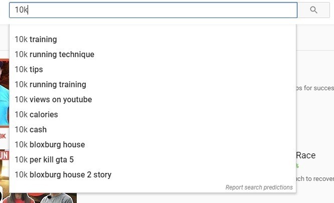
Once the YouTube algorithm has done its job in refining what information you want to see, it becomes the job of the thumbnail to entice you to click on the content.
It’s the first thing the viewer sees and represents over 80% of the semantic decision to engage with your content.
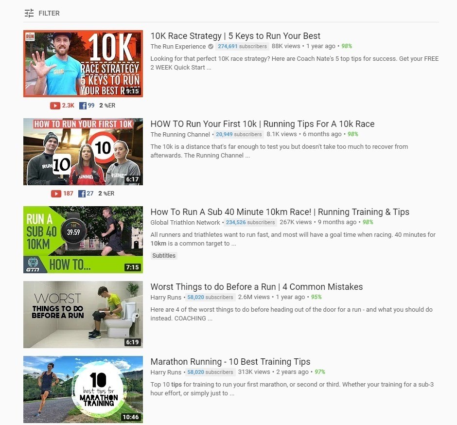
These are my results, but which one I chose is up to me.
Who reads the title of an article on social?
Whether browsing YouTube, Instagram or your Facebook feed, you are making decisions on which content to click on in fractions of a second. The thumbnail forms part of that decision making process and as a result, it has become the biggest advert that publishers have for their content.
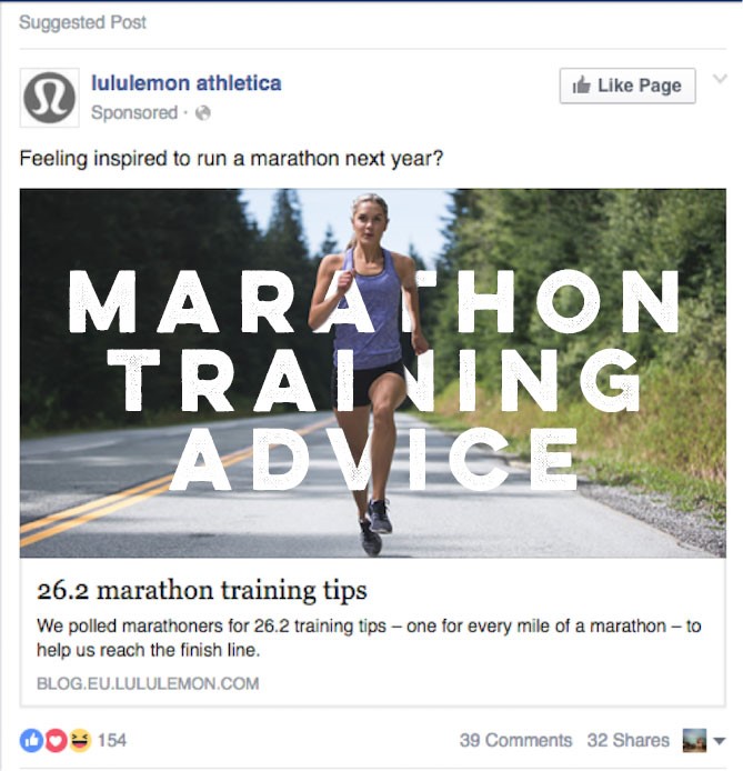
Your decision to engage with these articles, links, or videos is typically down to the position in the search and the strength of the visual (the thumbnail).
But how did this thumbnail get so important?
Well the short answer is the volume of content. Even the best aggregators in the business (Google algorithms) can only optimise a search experience so far. It’s incumbent on the user to decide where their click goes, and what they watch or read.
Take Netflix as an example:
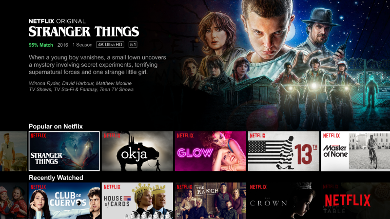
The primary goal of Netflix is to develop and cultivate a personalised curated “recommendation system” for each viewer - to keep them excited, engaging, and viewing, time after time. For just by drawing viewers in with a specific program (or goal), but to keep them hooked in the transition time between finishing their program and selecting what to do next.
Netflix has a catalogue of millions of titles. Thumbnails typically get a view time of around 1.8 seconds and Netflix has just 90 seconds to draw viewers into making a decision before that user goes off to do something else. As a result, the company spends a long time refining this journey.
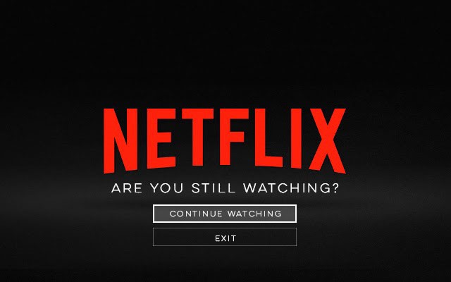
Netflix uses a suite of different techniques to get you to stay in their ecosystem.
- Curated (personal) Trailers
- Individual, trailer formats across device
- Feature content with “New Episodes”
- Content specific “match scores”
But it’s primarily the thumbnail (across viewing device) that has the greatest impact on their decision model.
Netflix uses a proprietary algorithm to source, create, and deploy thousands of personalised thumbnails of each program on Netflix to each Netflix viewer. These thumbnails are sourced from the video content available throughout the season (if episodic) and categorised using a sophisticated image analysis engine (Aesthetic Visual Analysis – AVA). Once these thumbnails have been collated, they are then curated, graded, meta-tagged and tweaked to generate the vast collection of interchangeable thumbnails Netflix can draw from.
Its how these thumbnails are used that’s truly amazing though…
Netflix employs an iterative A/B testing regime to help define how an individual viewer engages with certain types of content, visual and aesthetic. This will change dependant on the time of day, device, mood or previous viewed content. It means that Netflix uses these parameters to help refine the style, layout, colour, and even content of each thumbnail to suit your immediate preferences.
So, if you are somebody who watches a lot of romantic comedies at the weekend, the thumbnails of supporting “meta-tagged” content will change to mirror attributes found in these forms of content. Actors that are regularly found in these forms of narrative will become more prominent in the thumbnails and colours with start to mirror the typical visuals attributes found in these genres.
Too far, never!
When it comes to finding an edge on the competition, creative art direction is never too far. Perhaps the level of personalisation that Netflix can attribute to their content library is a little more advanced than many brands and publishers either can or need to achieve, but it’s the theory behind this that’s important to bear in mind.
Understanding your audience (as a viewing public) as well as traditional demographic metrics will help you refine and define their viewing tendencies.
Create thumbnails that speak to your content. Tell the potential viewer what they are likely to get if they click on your video, and make sure the video addresses this narrative.
Don’t be afraid to tweak your brand style to help accommodate a more niched audience subsets, in selective streams of content. Embrace these niches and build your communities.
A/B test your thumbnails in legacy and organic content – track the “viewer per hour” levels over defined times to understand and refine those optimum levels.


